Top 5 UX Loading Animations
Dec 15, 2022

I love me a well-designed loading animation!
I started thinking about the loading icon back in 2014 when I had my first job in UX at Google as a motion designer. This was a time when loading speeds were slower than today, and technology was getting advanced enough to incorporate animations. When I designed the Google circular loader (ahem, not to be braggadocious, but uh, I only used a gazillion times, all over the place, every day, teehee), I saw how a loader could do many things. It can make me less impatient while waiting for content to load. It can communicate, “Yeah, I know you’re waiting, but hey, here’s a gentle little sideshow.” It even makes me feel – sniff – taken care of.
I’d love to learn how much time we spend in our lives inadvertently watching a loading icon. (Is it something like we spend 240 days on the toilet in our lives? source) So why not make it nice? I tip my hat to these amazing loading animations that clearly get this unique UX opportunity. These are the kinds of loading animations that are so nice I’d get disappointed when the content loads.
1. Workable

What a fun, simple loader! I just love the little shapes that oompa-loopa their way from one position or shape to the next. This is one of those “Why haven’t I ever thought of this?” designs that I’d love to see more around.
2. Face
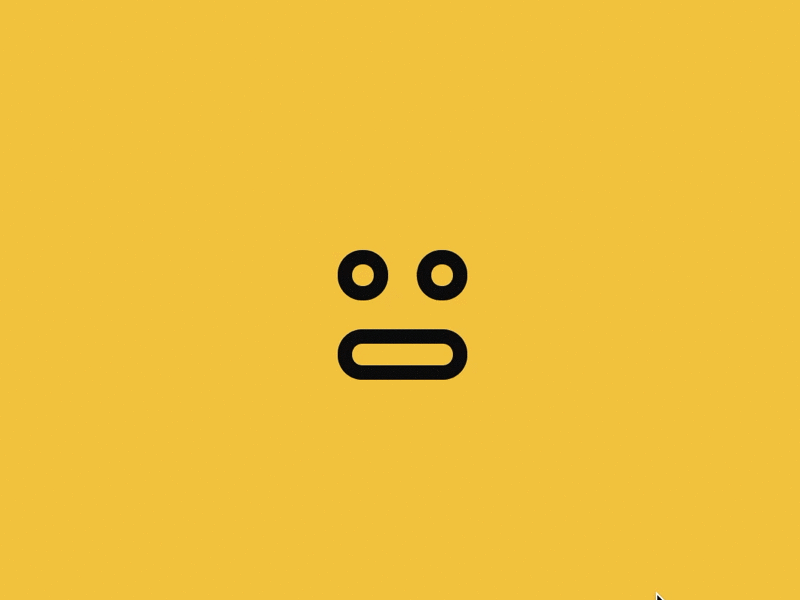
When I saw this, I got the same kind of brain tickle I got the first time I ever saw that magic trick of disembodying and reattaching a thumb. Plus, I’m a sucker for anything with a neutral facial expression. 😐 is my all-time favorite emoji.
3. Animal Crossing

Why is this so small, way down in the lower right-hand corner against a black screen? If I were in the room with the designers of this game, I’d suggest making it bigger, centered, against a colored background. This cute little baby is a star! And no one puts baby in a corner.
4. Google Home


I know I said I used to work for Google, so I swear I had nothing to do with this or know any of these people (it’s a very large company). I love the playfulness of this series and how it really leans into a “let’s have a little fun while you wait” philosophy. What’s extra special about it for me is that it taps into my lizard brain, surfacing dormant childhood memories of playing with geometric, wooden toys. Specifically, it harkens to an analog, tactile feeling I got from those toys with wooden beads threaded through colorful wires I played with as a kid in a doctor's waiting room. What a great, gentle, and playful way to wait.
5. Deconstructed Clock

I can stare at this deconstructed clock and contemplate the construction and deconstruction of time. The yin and yang of time passing and approaching, the pendulum between past and future, the uncontrollable persistence of a clockwise motion. Maybe the designer had some of these in mind…or none. Regardless, I can totally picture this as a large projection installation in an art gallery. This transcends UX.
Continue Reading


Top 5 UX Loading Animations
Dec 15, 2022
I love me a well-designed loading animation!
I started thinking about the loading icon back in 2014 when I had my first job in UX at Google as a motion designer. This was a time when loading speeds were slower than today, and technology was getting advanced enough to incorporate animations. When I designed the Google circular loader (ahem, not to be braggadocious, but uh, I only used a gazillion times, all over the place, every day, teehee), I saw how a loader could do many things. It can make me less impatient while waiting for content to load. It can communicate, “Yeah, I know you’re waiting, but hey, here’s a gentle little sideshow.” It even makes me feel – sniff – taken care of.
I’d love to learn how much time we spend in our lives inadvertently watching a loading icon. (Is it something like we spend 240 days on the toilet in our lives? source) So why not make it nice? I tip my hat to these amazing loading animations that clearly get this unique UX opportunity. These are the kinds of loading animations that are so nice I’d get disappointed when the content loads.
1. Workable
What a fun, simple loader! I just love the little shapes that oompa-loopa their way from one position or shape to the next. This is one of those “Why haven’t I ever thought of this?” designs that I’d love to see more around.
2. Face
When I saw this, I got the same kind of brain tickle I got the first time I ever saw that magic trick of disembodying and reattaching a thumb. Plus, I’m a sucker for anything with a neutral facial expression. 😐 is my all-time favorite emoji.
3. Animal Crossing
Why is this so small, way down in the lower right-hand corner against a black screen? If I were in the room with the designers of this game, I’d suggest making it bigger, centered, against a colored background. This cute little baby is a star! And no one puts baby in a corner.
4. Google Home
I know I said I used to work for Google, so I swear I had nothing to do with this or know any of these people (it’s a very large company). I love the playfulness of this series and how it really leans into a “let’s have a little fun while you wait” philosophy. What’s extra special about it for me is that it taps into my lizard brain, surfacing dormant childhood memories of playing with geometric, wooden toys. Specifically, it harkens to an analog, tactile feeling I got from those toys with wooden beads threaded through colorful wires I played with as a kid in a doctor's waiting room. What a great, gentle, and playful way to wait.
5. Deconstructed Clock
I can stare at this deconstructed clock and contemplate the construction and deconstruction of time. The yin and yang of time passing and approaching, the pendulum between past and future, the uncontrollable persistence of a clockwise motion. Maybe the designer had some of these in mind…or none. Regardless, I can totally picture this as a large projection installation in an art gallery. This transcends UX.